If you have ever managed or used a digital product, it’s likely that you have experienced a user onboarding flow at some point. We explore what user onboarding is, why it’s important to get it right and take a look at some world-class examples of onboarding experiences.
What is user onboarding?
When people think of user onboarding, their first thoughts might be the screens you have to swipe through before you can use a new app or a set of instructions to guide you through using the product you have just signed up for. While these might be valid ways to execute user onboarding, the true goal is much more about customer value, and specifically, making sure that your new users understand what problem your product solves for them.
User onboarding definition
In short, user onboarding can be defined as the initial experience with your product that leads to the internalization of value by your customers.
Why is the user onboarding so important?
User onboarding is important for a number of reasons. When users first use or install your product there is a window of opportunity to capture them and help them understand the value that they can get from your product, which will hopefully translate into return usage, revenue and other high value actions.
The onboarding process doesn’t just stop at first use, there is also a period after the initial phase where you can continue to take your users on a journey that continues to help them realize value from your product – this can take many different forms, some of which we will discuss later on.
How to measure new user onboarding effectiveness?
There are many ways to measure how effective your new user onboarding is and some of this will come down to individual product and business goals. You might consider qualitative measurements which look at things like how useful new users found your onboarding flow or more quantitative measures such as % of users who took an action (e.g. signed up to something / created an account etc) and later, what % of those users turned into more loyal customers who return regularly or make a purchase.
Any good onboarding flow will give users a way to exit out of it – this can be a really effective way to measure whether you’re succeeding (in the first instance) to capture new users and show them value or whether you’re having a negative impact with the wrong kind of messaging. Measuring the % of users who close out your onboarding flow and at which point they do this can help you to refine your messaging and content.
6 elements of the best onboarding flows
Onboarding flows can contain many different elements and not all are restricted to using the product itself. Notification or email flow onboarding can also factor here, as well as different content formats, such as video. Let’s take a look at some of those different elements.
Sign-up / create an account form
Capturing user data upfront can be very valuable for your product and business as a way to keep in touch with your customer base, but you have to consider the value exchange for the user also – what do they get by signing up or creating an account? Consider if this is the most important action you want your new users to take during onboarding.
Initial login screen
If you have successfully signed up a new user then it’s important to consider what they see upon first sign in. What’s the next most important action you want them to take to help them understand the value of your product?
Email communications
Email can be a powerful medium to engage your new user base with. How might you use a welcome email in the initial stages of your onboarding flow? Could you leverage email newsletters as educational aids to help users take actions to solve user needs? Perhaps you have a set of milestones that help users to realize value from your product that could be communicated via event-based emails – so many possibilities here!
App notifications
In a similar way to email communications, app notifications can be used to engage new users early in their onboarding flow. There are plenty of whizzy technologies that can help you to personalize individual experiences for new users based on their behavior in your app, which can increase the likelihood of success when it comes to your user onboarding goals.
Empty states
Perhaps a less obvious element is empty states, or what the user sees if they hit a screen or page on your product that doesn’t contain any content until they take an action. These spaces can be used in powerful ways to give guidance in context – for example a page which shows who you’re following which is initially empty could be used as a space to show how to follow someone or to make suggestions about who to follow.
Product tutorials
Sometimes new users can benefit from product tutorials and these can take different formats – everything from a short video explainer through to a guided product tour that encourages new users to set something up or take particular actions while using the product itself.
8 best practices when creating an onboarding flow
There are many things to consider when creating an onboarding flow – here are some of the key factors to bear in mind.
Understand what user problem(s) you’re solving
The number one thing to consider when creating an onboarding flow is to make sure you have a deep understanding of what problem or problems your product is solving for your users. This is so important because you need to be able to demonstrate the value you are providing to your new customers via your onboarding flow in order to capture them during their initial use of your product. If users can’t see how your product is solving their problems the likelihood is that they will churn or choose a different solution.
Set success metrics and iterate
The ability to measure the success of your onboarding flow is key to getting it right (and don’t expect to get it right the first time!). Once you have established the baselines for success you can see what’s working and what isn’t and iterate your flow accordingly. You might consider things such as user activation, retention or revenue.
Ask users to take an action
An important part of your onboarding flow will be the action you ask your users to complete – this should be something that helps users to understand the value of your product. This could be anything from asking them to complete a simple task on screen to offering them a way to sign up for relevant notifications or emails.
Include a moment of delight
Moments of delight, or aha moments are often overlooked when it comes to product development. These can be moments of surprise, delight at something fun in your flow or a real lightbulb moment where they realize exactly how your product is going to solve their problem. Incorporating one into your onboarding flow can really help you to establish and emotional link with your users
Keep it ‘on brand’
Perhaps something less obvious to consider is the branding of your onboarding flow. You want to make sure that the overall tone and visual design is in-keeping with the rest of your product as first impressions count when it comes to look and feel.
Make progress clear
How many times have you used a new product, been excited to try it out but had to swipe through endless screens with no end in sight? Users like to know where they are and how much progress they have made through your onboarding process and when they will be getting to the really meaty part – using your product! This can be simply achieved by using a progress bar or numbering the steps in the experience.
Keep the flow going
Just because your initial onboarding sequence and users have started using your product, it doesn’t mean that the onboarding journey has to end there. Consider what kind of follow-up actions you might want your users to take or what further information they might need to enhance their use of your product. Examples might be in-product demos, emails or notifications.
Give users a way to exit
Perhaps a less obvious consideration is the scenario where your onboarding flow doesn’t hit the mark or your new users just want to get straight into using your product. Always consider giving your users a way to exit the onboarding process – this will increase the chances of retaining them and lower the risk of irritating them – after all, they are keen to use your product as quickly as possible!
5 mistakes to avoid when designing your user onboarding experience
There can be many pitfalls when designing your onboarding experience. Here are a few key things to consider on your journey to better user onboarding.
Forgetting that user onboarding starts early
The majority of user onboarding occurs once a user gets into your product – from the “getting started” phase onwards. However, it’s important to remember that onboarding actually begins further up the funnel, really from when users start interacting with your brand. This could be on social media, search results page or other advertising. It’s never too soon to be thinking about onboarding when it comes to your funnel!
Asking users to take too many actions upfront
In the initial stages of onboarding with your product, it can be too overwhelming for users to be asked to take multiple actions – for example: signing up for an account, signing up for email newsletters or cycling through multiple actions in the interface. Instead try to focus on the single most impactful action that helps your users get the job done.
Overloading your flow with too much information
As you might imagine, users are keen to start using your product and may be put off if they have to cycle through too many screens or take in too much information from the get-go. You don’t need to walk your users through your entire product – instead focus on quick wins that help them realize core value upfront.
Leaving a value gap
When we talk about the value gap we are thinking about the potential delta between the value a user perceives that they will receive from your product vs the experience that they actually have with your product. You want to make sure that your onboarding walkthrough closes that gap as much as possible so that you can retain those users in the future.
Spamming your users with email
Email can be a powerful tool for communicating with your user base, however, you don’t want to irritate them with endless spam once they have signed up to use your product. Be considerate about when to send email – always make sure that the content helps to build on their existing experience.
3 great user onboarding examples
We’ve spoken a lot about the dos and don’ts of onboarding – now it’s time to take a look at some great user onboarding experiences. Here are a few of our favorites.
Netflix
Most of us probably have a Netflix account and have successfully passed through their onboarding journey at some point. Their onboarding flow has really evolved over the years to ensure that they capture and sign up as many customers as possible. How do they do this? Let’s take a look.
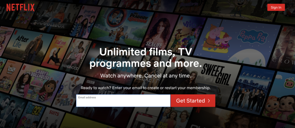
The first screen that you see when you hit their homepage is this one – nice and simple with a very clear, single call to action – just pop in your email and you’re on your way to having access to unlimited content that you can watch anywhere. It’s also clear that you can cancel any time. The value exchange is very transparent:
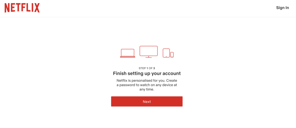
The next screen you see is this one which prompts you to finishing setting up your account – it’s clear here that this is step 1 of 3 and the messaging continues to build on the value proposition – now we see that not only can we watch unlimited content on any device, anytime, but that the experience is personalized:
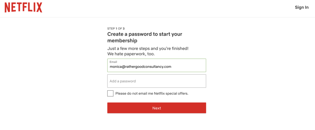
The next screen asks us to create a password – the messaging is re-assuring that we don’t have many steps left to take and empathizes with us about the need for paperwork – again, each screen is only asking us to do one thing at a time and the UI is very clear:
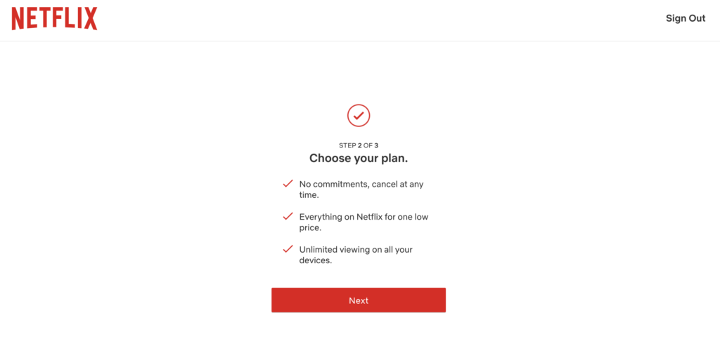
Step 2 of 3 is asking us to choose a plan – again, there are simple reminders of the value proposition here:
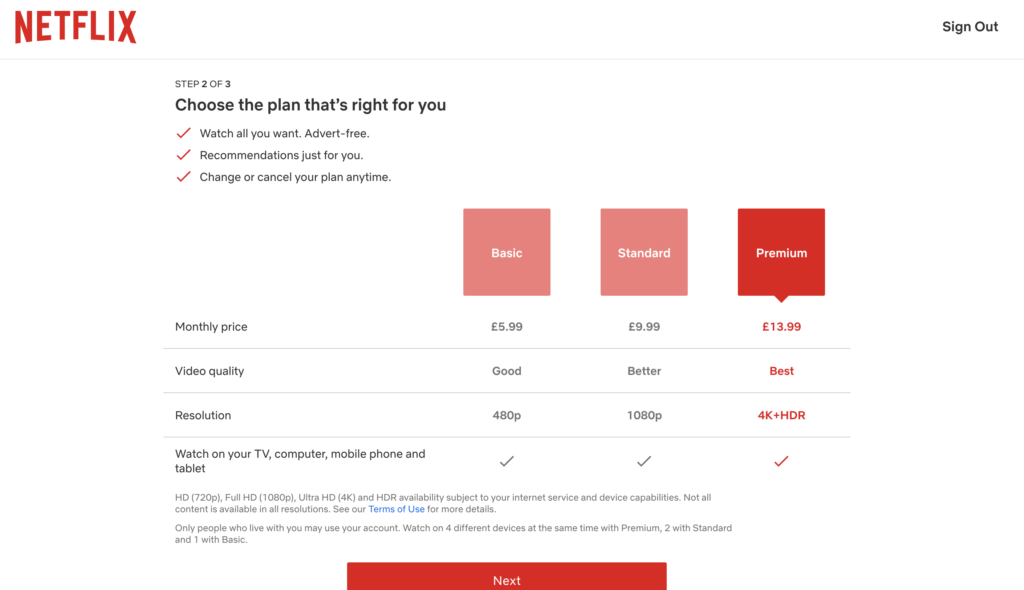
The next screen is once again reinforcing the value exchange and now we have the added message about advert-free. The options are clearly laid out with the highest value option highlighted – you simply have to pick an option and press “Next” – again, a single action per screen:
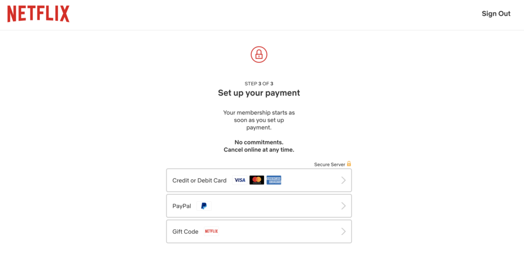
Finally, step 3 of 3 is onto payment – a super simple screen to pick the best payment option for you:
Slack
Another product that many of us are likely to use is Slack. They have taken a different approach to onboarding as they allow free use of their product functionality in the first instance.
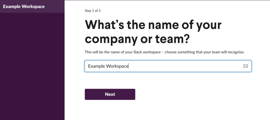
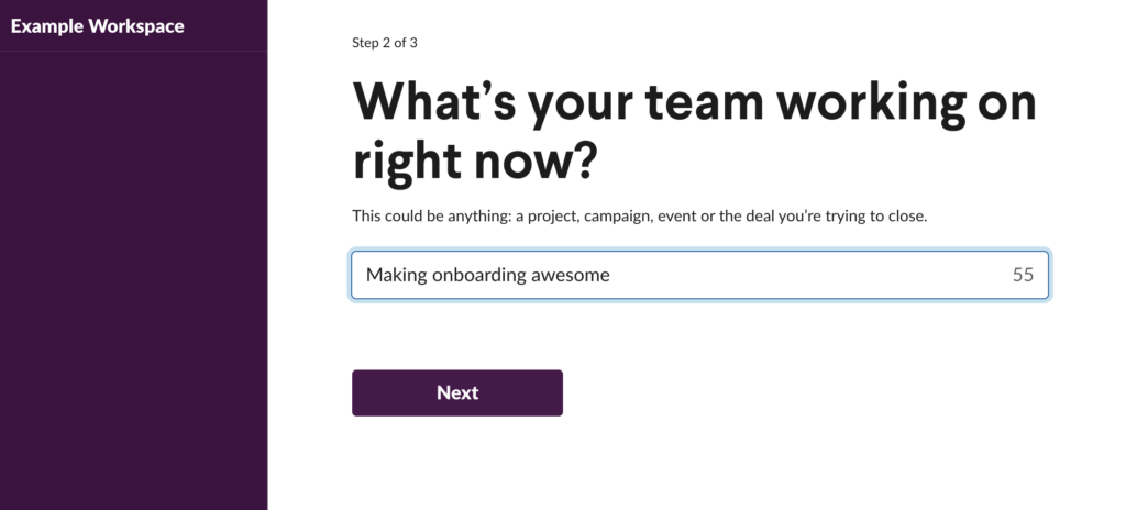
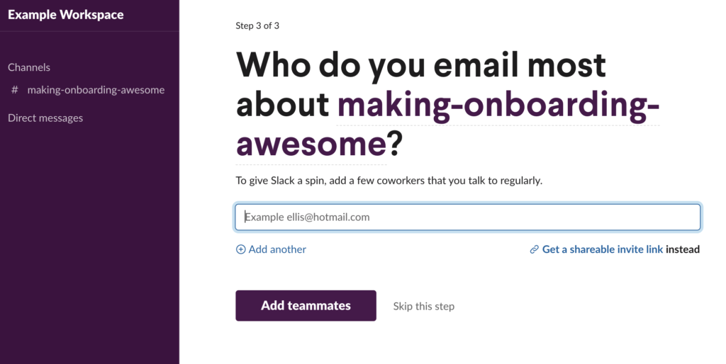
Their goal is to get you set up and using the product as quickly as possible, so their onboarding flow focuses on getting you to create your first workspace and channel, as well as inviting some colleagues. Again, they have clear signposting on the number of steps left in the flow as well as a single call to action per screen:
Canva
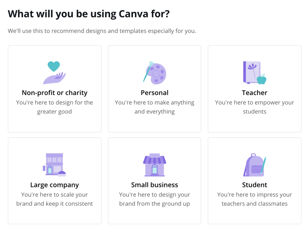
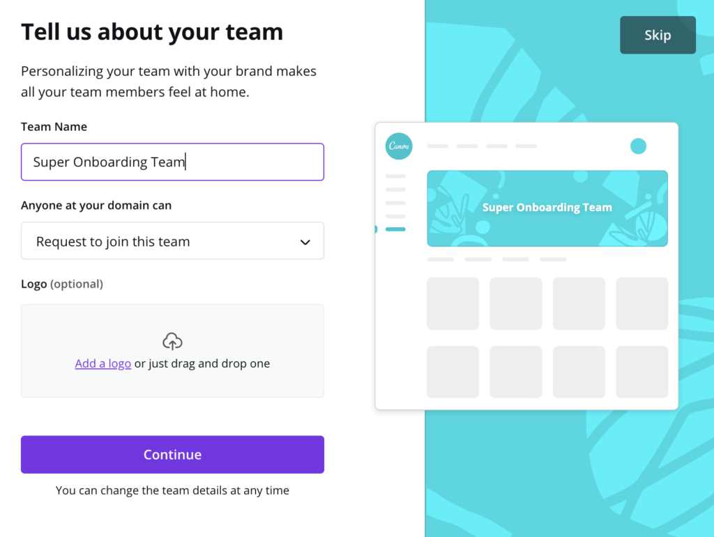
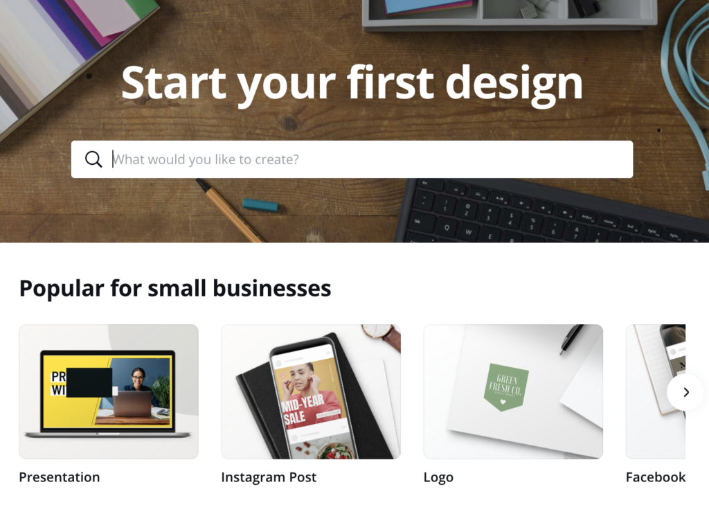
For anyone who hasn’t heard of it, Canva is a graphic design platform that allows users to create visual content for social media, presentations and posters, among other things. They have a diverse range of users so they have chosen to focus their onboarding on getting a personalized experience set up to ensure that their users get the most out of their product experience.
The onboarding flow includes delightful touches like a real-time updating example of what your workspace will look like when you add your team information (as well as that all-important “Skip” button!):
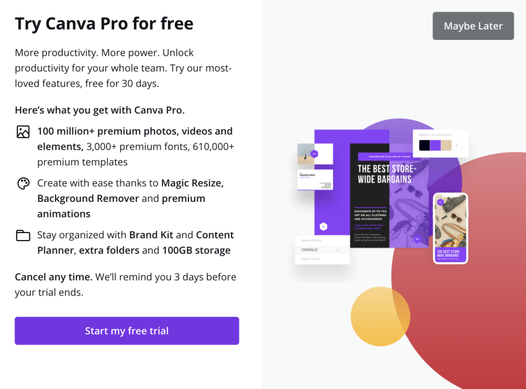
They have also snuck in an upsell for their Pro product and the offer of a free trial – but again, you are able to easily skip this step:
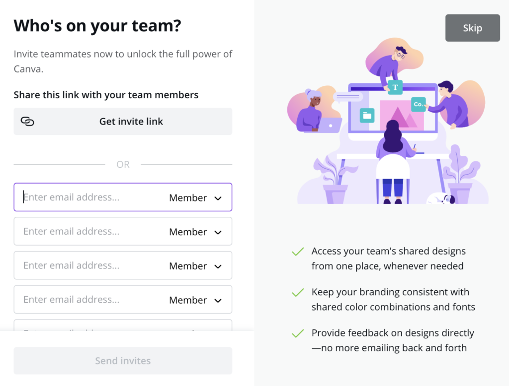
Similar to Slack, you are invited to add team members and there is also some nice messaging on the value exchange – share designs, keep branding consistent and cut down on email feedback:
Key takeaways
Overall, there is a lot to consider when it comes to your onboarding flow and the success of your product can be very reliant on getting it right! Remember that the all-important starting point is really understanding your user problems, use cases and jobs to be done so that you can tailor your messaging and actions and really hit home the value exchange you are providing for them. Onboarding is not a simple set it and forget it piece of work – it is an evolving experience that will need to be continuously iterated until you can find what works best for your users and for your business.
FAQs
What is the goal of user onboarding?
The main goal of user onboarding is two-fold: the first part is to ensure that your users understand and experience the value that your product features can bring them and the second is to fullfil your business success metrics, whether those be retention, subscription or something else.
Is sign up part of user onboarding?
Sign-up can be a part of user onboarding if you deem it necessary to fulfil the goals described above. As long as users can understand the value they get from signing up, it can certainly be included in user onboarding.
What is progressive onboarding?
Progressive onboarding is all about users learning by doing – so if you’re using a new mobile app, for example, information might be presented to you as you use it via tooltips, rather than having you cycle through it upfront before you have experienced the product.
